Unilend
Concept & Objectives
The goal was to design the interface structure and user experience for Unilend’s main web platform with all key sections needed for a DeFi project, including rewards and leaderboard features.
My Role
I created the prototype and final interface, developed the visual style based on the brand system, and ensured design consistency across the web platform and social media materials.
Client:
Units
Industry:
Web3, DeFi, Fintech
Development stages
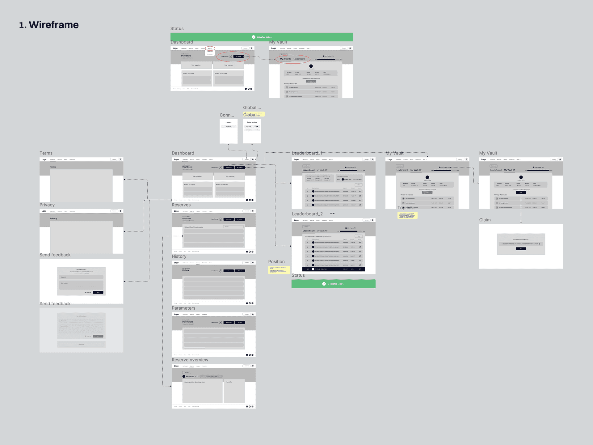
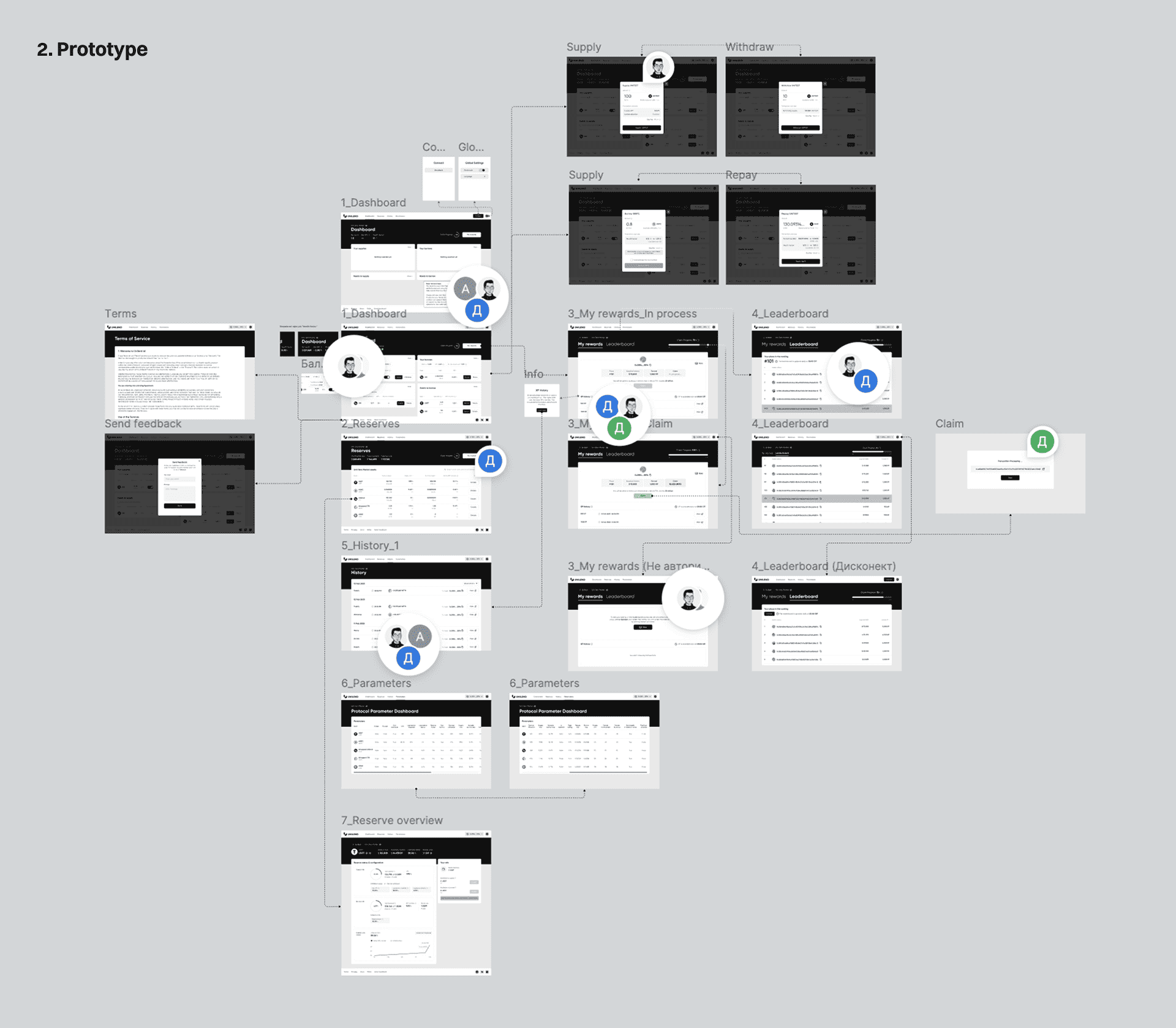
After discussing the project with the client’s product owner and aligning on the requirements and user flows, I created the wireframe that defined the product structure and action sequence. I then developed the prototype that visualized the functionality and key interface states.
Once the design concept was approved, I designed the final dApp interface.
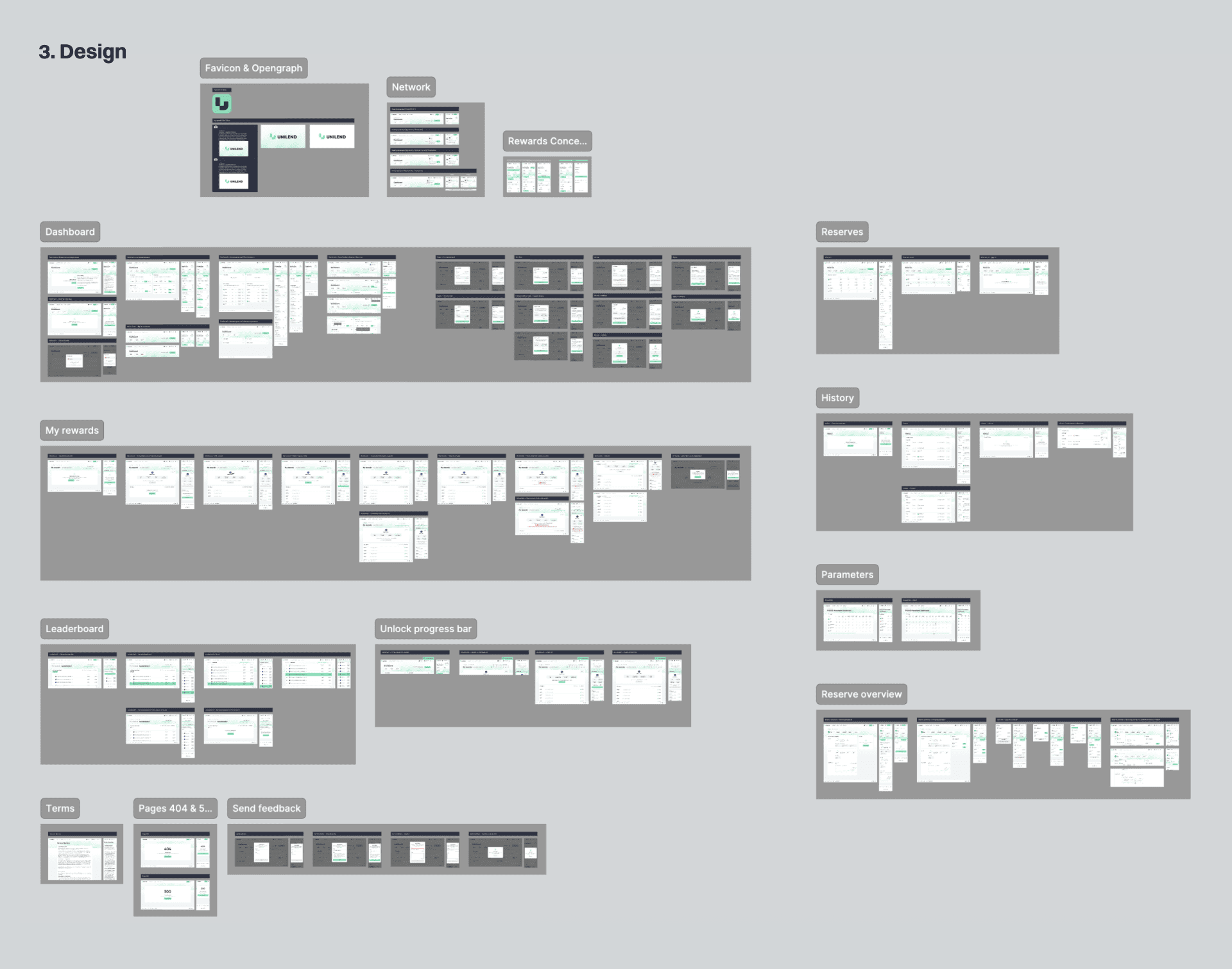
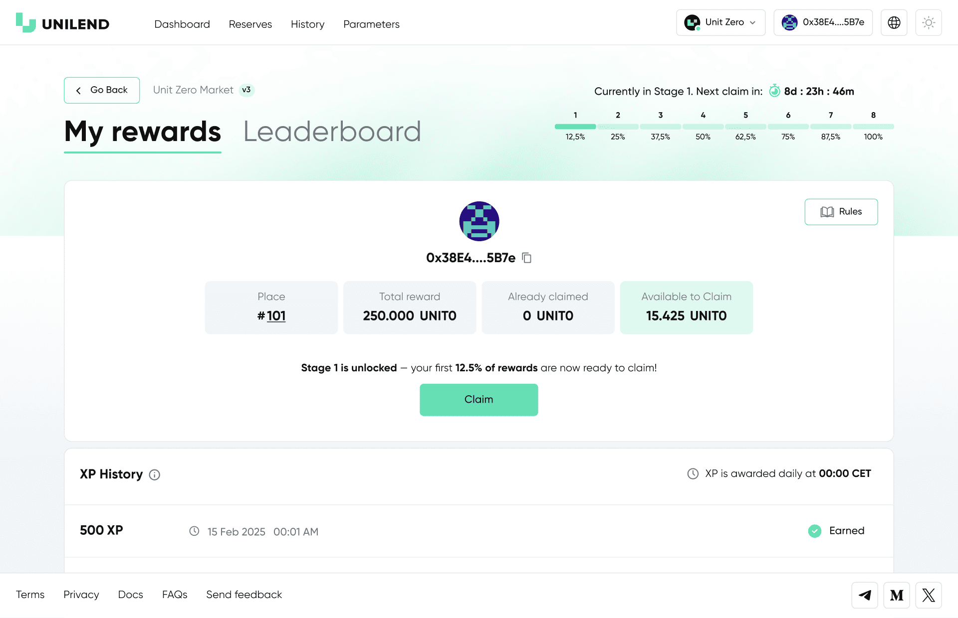
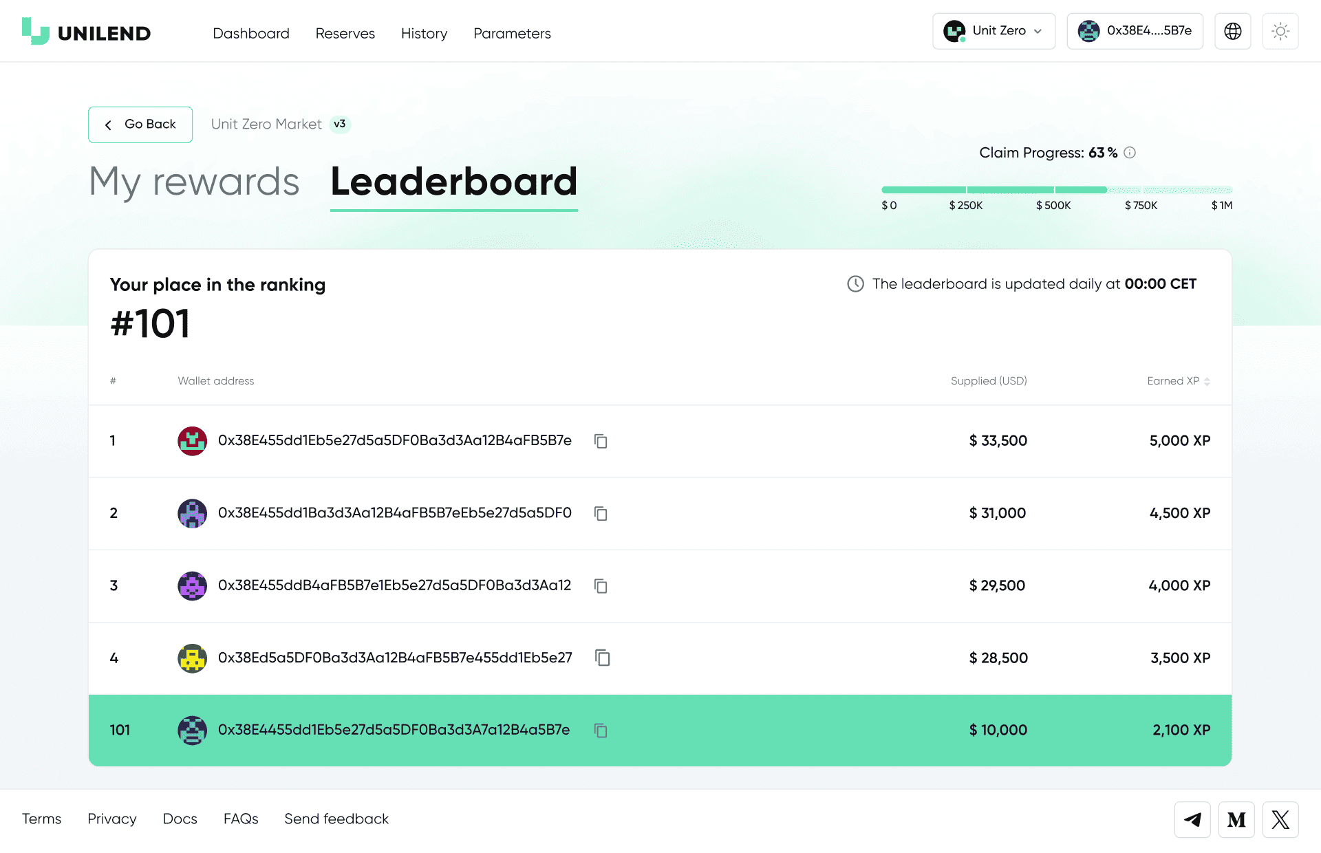
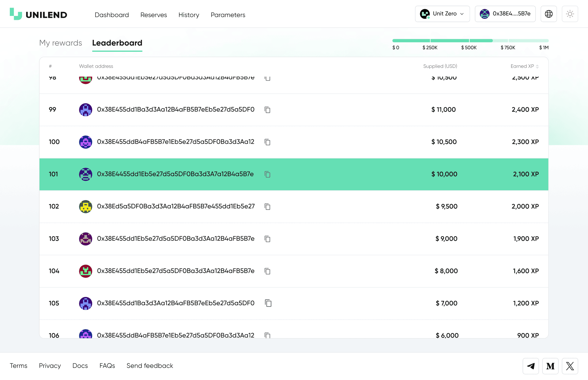
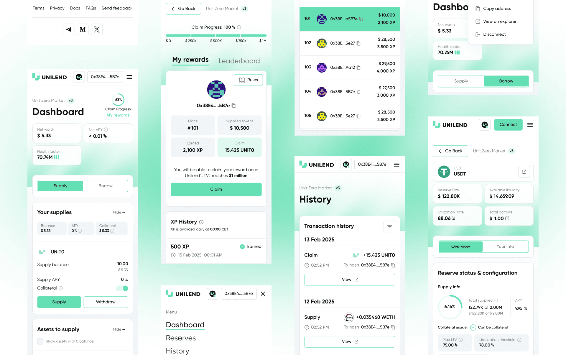
My rewards and Leaderboard
One of the core components of the dApp was the development of the My rewards and Leaderboard sections. Users could track their progress, view accumulated XP, see their current program stage, and monitor their ranking based on protocol activity.
Once the project reached the target TVL of $1M, 8 reward-distribution stages became available. At each stage, users could claim a portion of their tokens, while the interface displayed the progress, available amounts, and a complete XP history overview.
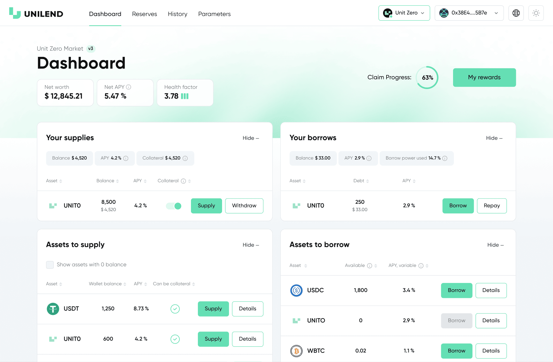
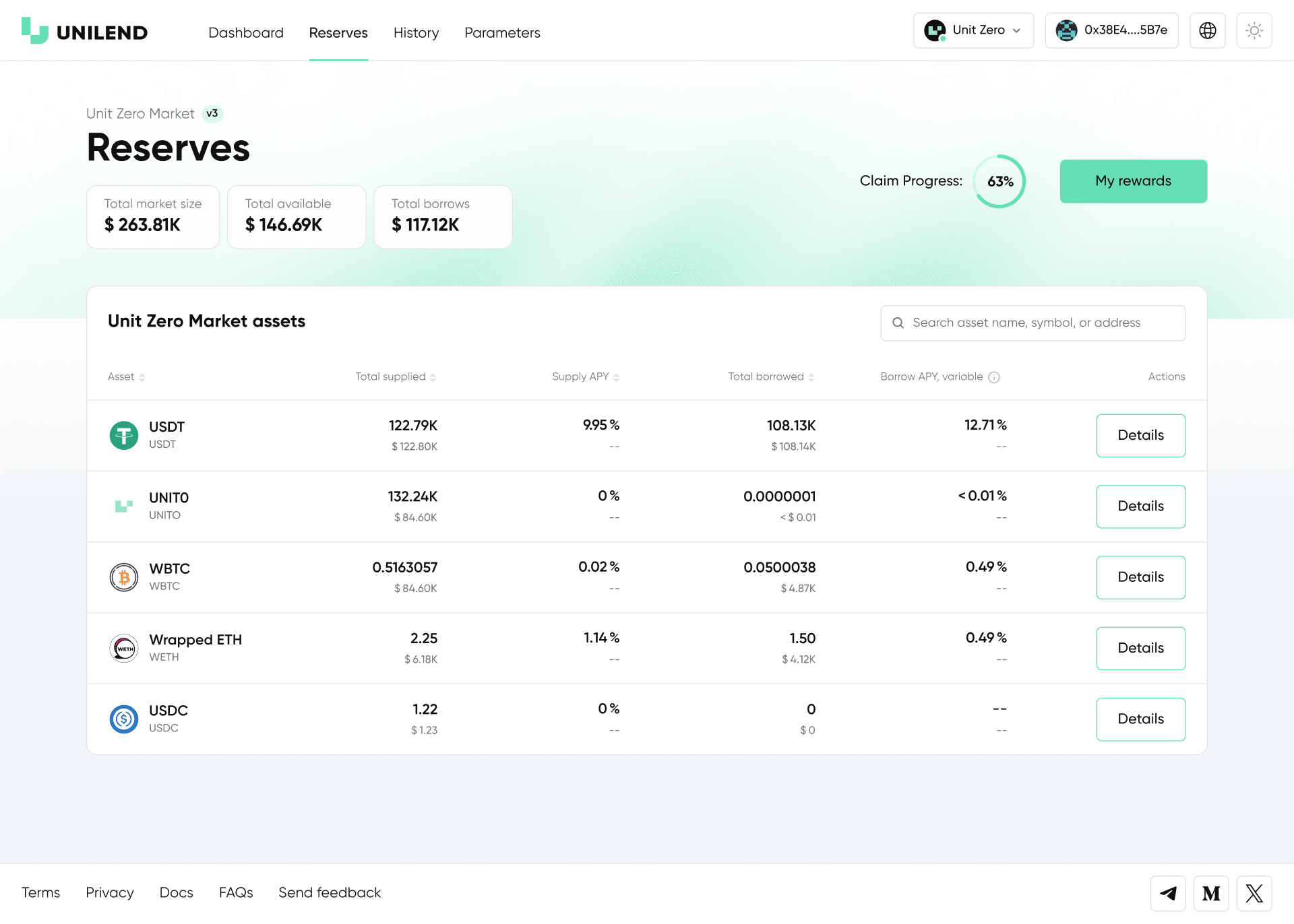
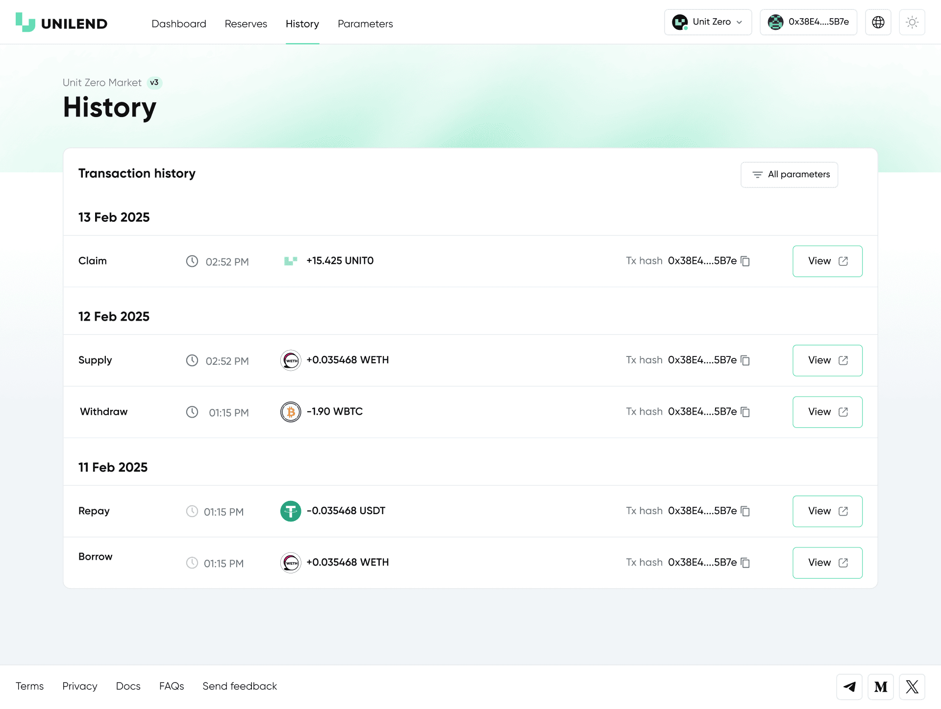
Reserves, History and Adaptation
Reserves present the core market metrics and asset data. History logs all user transactions. The section also includes mobile adaptations that demonstrate how the interface scales and functions on smaller screens.
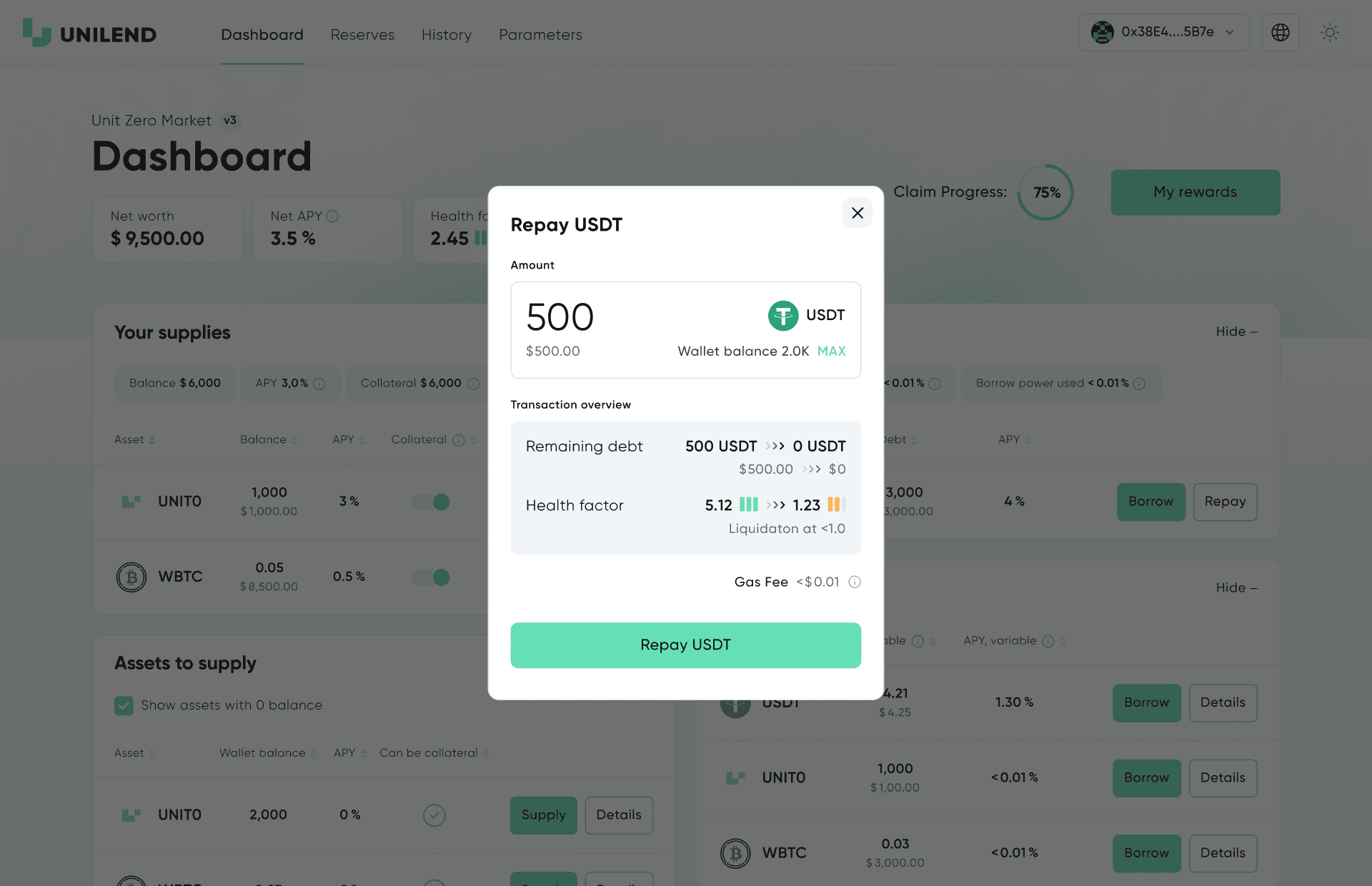
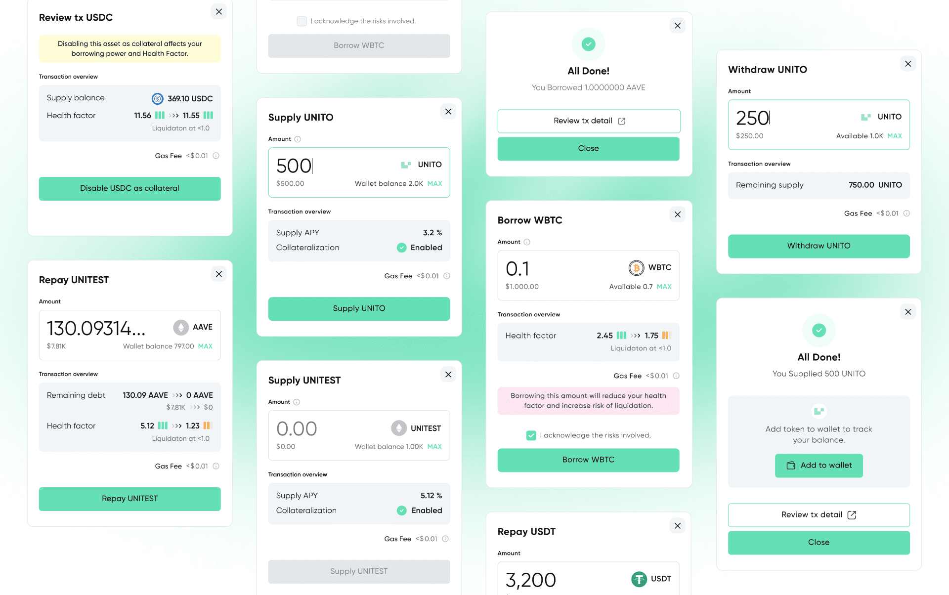
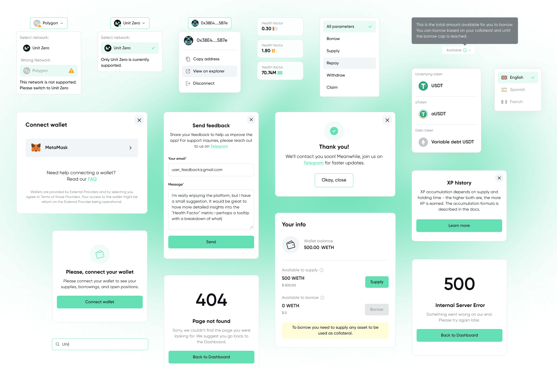
Key Interface Pop-ups and UI Elements
A collection of core interface windows, including pop-ups for supply, borrow, withdraw, collateral management, as well as dropdowns, states and auxiliary system screens.
This section showcases the supporting UI logic that ensures a clear and seamless user experience.